Are you new to the digital signage world and want to learn more about how you can add it to your...
Digital signage is one of the most powerful tools in your communication kit – but even the best screens can fall flat if the content strategy isn’t quite right. Whether you're just getting started or you’ve been running screens for years – here are 10 common mistakes we see (and how to dodge them).
No content schedule
If your screen has been playing the same loop since last quarter, people have stopped noticing. Guaranteed. Digital signage works best when it’s timely, relevant, and feels alive. A well-planned content schedule means you can align your messaging with things like:
-
Time of day – promote coffee in the morning, lunch deals at noon, and happy hour in the afternoon.
-
Day of the week – feature weekend events on Thursdays or run Friday-only flash promos.
-
Seasonal shifts – refresh campaigns to match holidays (EOFY, back-to-school periods or local events).
-
Rotating campaigns – mix up promos, educational content, customer reviews, or staff shoutouts so screens feel fresh (even if you're working with the same core content). 🙌
Using Fusion Signage’s built-in scheduling tools, you can automate all of this. Set it and forget it – your screen will do the heavy lifting while you focus on your day-to-day.
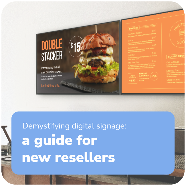
Wrong screen placement
Digital signage screens are captivating, but if they're behind a pillar or facing away from high-traffic areas – you're losing viewers!
Avoid it by: using one of our trusted resellers to install the right digital signage for you.
Need to get in contact with a reseller? Get in touch here. 💙
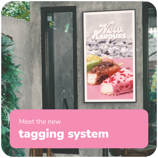
Not designing for the screen's aspect ratio
If your content looks stretched, cropped, blurry, or has black bars – that can be fixed! It's not anything wring with your screen!
How to avoid it:
- Ensure that the resolution of the content you are displaying matches the screen resolution. If the content is of a lower resolution, it can become blurry or stretched on a higher resolution screen. We recommend 1920 x 1080p as a good baseline resolution.
- Check the fit / fill / stretch! If your content is lower resolution and you are using the fill or stretch options within the playlist – this will cause your content to become pixelated.
- Make sure your content is tailored to the aspect ratio of your screen. A typical aspect ratio is 16:9 for landscape or 9:16 for portrait. This may be different if you are using an LED or projector (so it is best to get in contact with your reseller if you are unsure).
Need more help? Click here for our Support Article.

 Final extra tip!
Digital signage isn’t just about displaying content – it’s about delivering the right message at the right time in the right way.
Nail those three and your screens will do more than just look good – they’ll work. ✨

Add a little something extra to your month 💌
The Monthly Catch-Up
A monthly email from us, to you
(But only if you want it). Sign up below.